With the analytic platforms and plethora of data available to website owners these days, much of the online acquisition process is no longer a mystery.
 But even with such insights, many website owners will build or improve their site based on intuition rather than data. Thinking something looks good and knowing something will increase your bottom line are two very different things.
Testing, tweaking and analyzing website functionality can be a complex process though, especially for the business or website owner who’s still getting used to the online space. I mean, there are web pages to design, functions to program, testing tools to integrate, analytics to understand…
So we’ve done some of the hard work for you. We’ve performed our own tests and researched countless others to bring you three of the most simple website tweaks that we’re certain will increase your online conversions.
1. Change the color of your call-to-action buttons to red
Is this the absolute best color to convert your website visitors? Possibly, possibly not, depending on your audience. But study after study has shown red to be an incredibly successful color for increasing conversions, so it’s a great starting point.
Grab a free trial with Optimizely and give this a try. It takes five minutes to set up and you can draw your own conclusions.
If you like what you see, try and test a few other colors, the text of the call-to-action or the size of the button.
Tactic best used for…sales and lead generation landing pages.
2. Add lead generation widgets
Are they annoying? Sometimes. Do they work? Yes.
You don’t have to go all-out with a full page, spammy popup; but a simple and subtle widget that collects email addresses or leads is a no-brainer.
We’ve doubled the size of our mailing list over the last couple of months with the addition of this simple newsletter signup widget:
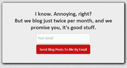
Try SumoMe if you’re interested in implementing something like this – it’s worked great for us (plus, it’s free!). You can test different popups, placements, and call-to-actions – and compare conversion rates right within the dashboard.
Tactic best used for…increasing email recipient lists, or lead generation for a new product or service.
3. Add social proof….everywhere
As humans, we are often indecisive and look to others to help us in decision making. As Lars Lofgren notes:
Whenever we’re uncertain about which action we should take, we automatically look to those around us for guidance.
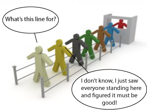 Social proof is simply a way to boost your credibility. Showcase your testimonials, showoff your client list, highlight your partners and emphasize your case studies.
This is as simple as adding widgets to your site, or perhaps a couple of new text or image blocks. Once again, you can use Optimizely to compare the conversion rate of your original page with that of these new designs.
Tactic best used for…boosting landing page conversions and brand credibility.
You can, quite literally, make these changes in one afternoon and see improved conversion rates within 24 hours. And we recommend you do exactly that.
Just make sure that you have the ability to monitor which tweaks and tactics are driving particular sets of results, so you know what works! Questions?
Learn how to do GREAT marketing...without being a "marketer" in our FREE 7-step strategy course delivered straight to your inbox.
We promise we don't spam, we don't email often, and we'll NEVER share your info with anyone else.